Exhibit 9 - Logo Work (T-Shirt Design)
Design
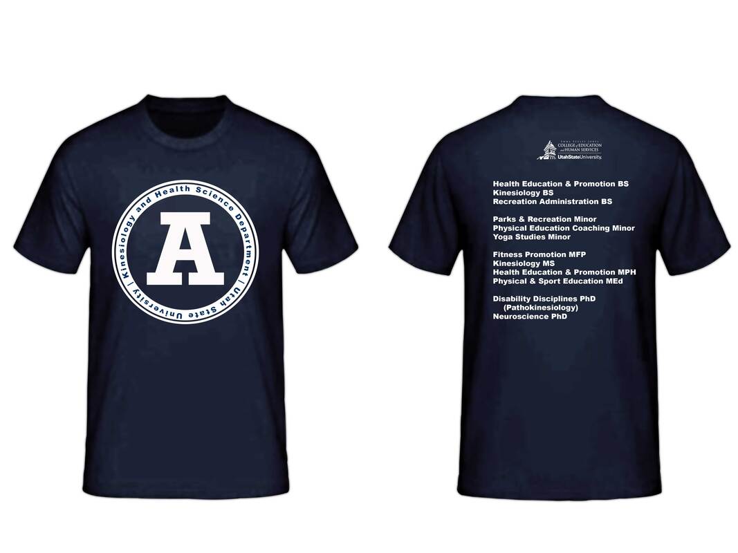
Background: The purpose of this project was to create a logo and t-shirt design for the Kinesiology and Health Science Department (KHS) at Utah State University. To create this logo consideration had to be given to requirements and guidelines from the university and from the Emma Eccles Jones College of Education which houses the KHS Department.This information was found by searching the USU website and took in considerations for colors options, options available for use. The department has had t-shirts in the past but a few years ago the name of the department was changed from the Health, Physical Education, and Recreation (HPER). Since the name change the department has not designed a new t-shirt or any other apparel since and the department head decided he would like to have t-shirts made.
Contrast: White is used to make the logos and text stand out.
Alignment: Text is left aligned on the back and logos have been centered when used.
Repetition: The same font is used throughout the design. The degrees are listed in the same order with the program title and degree abbreviation listed at the end.
Proximity: The department programs are grouped by level: the bachelor programs grouped together, minors, and graduate programs.
Font: Arial Black
Color Scheme: Monochromatic. The only colors used in this design are white and Navy blue.
Photoshop
I began this project by gathering the different images needed. I started with the reference photo for the t-shirt by googling "navy t-shirt" and then I selected one that I liked. I then googled the USU "A" Logo and selected a reference photo that had a white background that I could outline easily.
I then opened a new document in Photoshop 16 in. x 12 in. 300 ppi and added the t-shirt reference as a new layer. I then used the pen tool to outline the t-shirt front and back and copied the selection to a new layer so that I could make adjustments to the t-shirt without affecting the background. I made another copy of the selection to make an adjustment to the levels of the t-shirt to add more contrast within the shirt. This affected the color of the shirt so I added a hue/saturation layer to bring our some of the darker navy in the shirt again. I then combined the three layers together so that I had the t-shirt reference without a background and an adjusted copy.
With the t-shirt finished I then began the design for the front of the t-shirt. I used the ellipses tool with the "Exclude Overlapping Shapes" option selected to create the outer ring of the logo. I created a new layer and repeated this step to create the inner ring. These two ellipses layer were combined to create the one shape that could be worked with. On this new layer, the ellipse tool was used to place a guide so that the text could be added to follow the curve of the ellipse.
I then opened the "A" logo reference photo as a new layer. I used the eraser tool to remove the extra text in the image, then used the select color range option to select the outline of the "A". I added a white color overlay to this layer. Then used the move and free transform tools to place the logos to fit the outer rings. I then copied all the logo pieces to a new layer and adjusted them to fit the size of the t-shirt and grouped these layers.
For the back of the t-shirt I used the text tool to list all the programs in the department and then placed them on the shirt. At this point I went back to refer to the branding guidelines for the university and college to see what more I needed to add. Within the college information there was a link for the college logo which I had not added yet. I opened this image as an additional layer and used adjusted and placed the logo using the move and transform tools.
The lock position tool was used to lock the design pieces in place so that they were not accidentally moved after being placed. The visibility tool was also used to hid layers that were no longer being used in the design.
Credits
Font: Arial Black
The reference photo for the t-shirt was found by googling "navy t-shirt."
The "A" Logo was found was by googling the "USU A Logo."
The CEHS Logo was provided from the CEHS IT Box folder for the logo.
The reference photo for the t-shirt was found by googling "navy t-shirt."
The "A" Logo was found was by googling the "USU A Logo."
The CEHS Logo was provided from the CEHS IT Box folder for the logo.
