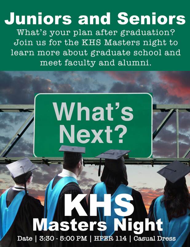
Exhibit 7 - Flyer
|
DesignBackground: My work has been trying to get information out about graduate school to our undergraduate students. We had found that there were students that were finishing their degrees without much understanding about graduate school so we have tried to provide opportunities for them to learn this information. One of the ideas that we are trying is to hold an event that the juniors and seniors can come learn more and interact with some of the department.
Contrast: The letters are a whitish color to help them stand out against the background. Different fonts were used for the headings and subtext. Alignment: Everything in the flyer is center aligned. Repetition: I used the same fonts for the headings and subtext. Proximity: Details for the event were kept together on the bottom of the page. Font: Arial Black and American Typewriter Color Schemes: Mostly analogous (greens, blues, violets). |
Photoshop
I opened a new file in photoshop 8 1/2 in by 11 in at 300 ppi. I then googled graduation images in google. When I found an image that I liked I opened it as a layer in this project. I then used the pen tool to create a path and then selection of the people in the images. I then moved the selection to a new layer. There was a gap between the two boys on the left and the girls on the right so I created two different paths to be able to adjust the images.
I then resized and place the images. I chose not to select the glasses for one of the boys in the image and used the healing brush to remove the glasses from his head. I also used the healing brush to remove a space between the two girls.
I then began to add the text in the image and placed the text. I felt that there was something missing as the students were looking towards something. I added a color fill below everything in the image. I googled images about whats next and found a sign that said what next, I then refined my search to what's next signs. I added this image as a layer beneath the graduates and place the image so that they were looking towards this.
I then used the select color range and eyedropper tool to select the velvet on their hoods. I then created a hue/saturation layer on this selection and adjusted the color to a light blue, which is the color of our college. I used the masking tool to fix some areas that had accidentally been selected when selecting the color range. I moved the text to fit better on the page. I added layer effects for the event title text to help it stand out against the graduation robes better and adjusted the opacity. I then used the healing brush to fill in some gaps I noticed in the image and to fix the color on the hoods that had not been selected with the selection tools above.
After receiving feedback for this project I went back into Photoshop and revised the project. It was recommended that I make all the text white without any effects so that it would stand out more and to adjust the background green to match the green of the sign in the image. To make these changes I used the text tool to adjust the color of the text and then removed the effects from the text. I then created a new fill layer and used the eyedropper tool to match the green to the green in the sign.
Credits
Fonts: Arial Black and American Typewriter
The images of the students graduating were found by googling "masters program" images.
The image of the sign was found by googling "what's next sign" images.
The images of the students graduating were found by googling "masters program" images.
The image of the sign was found by googling "what's next sign" images.
