Exhibit 3 - Poster
Design
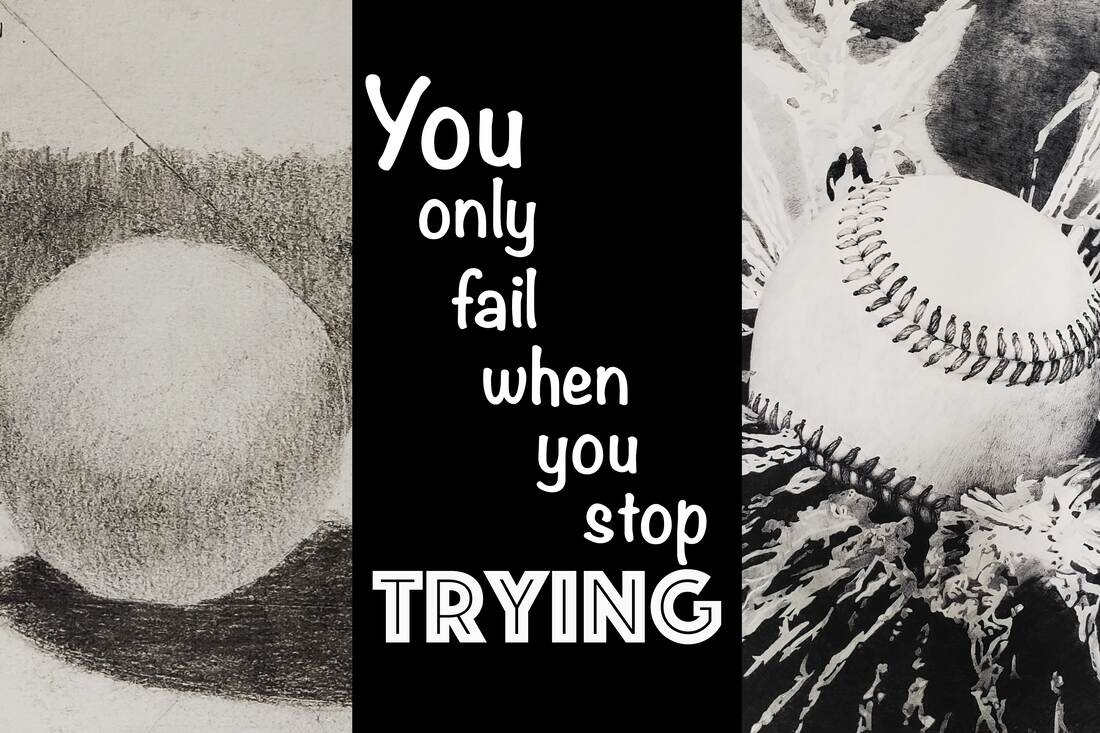
Background: One of my sisters is an art teacher in an elementary school. As she is teaching the children one of her main frustrations is that the students do not want to do the work and complete the exercises that she has for them. They don't want to do the work and things that are needed for them to be able to produce the art projects that they are envisioning. This poster was designed with her classes in mind so that she could remind them that they need to continue to try and work to get better.
Contrast: I used contrast in the text through the text size and font. The main message for this poster was for students to try so emphasis was put on this word through contrast. There was also contrast between the pictures in the difference between the pictures of the shading exercises and the completed picture.
Alignment: The first and last word of the text is left aligned.
Repetition: I used the same font and color within the quote and used the same colors throughout the project.
Proximity: I kept the pictures of the shading exercises close together to show that they were similar. I also kept the text of the quote together to keep the connected feeling of the quote.
Font: I chose the Noteworth font because of the smooth comfortable lines and the Phosphate because of the harder edges. These two fonts contrasted against each other.
Color Schemes: I chose to use a color scheme of blacks, grays, and whites because graphite pencils were the medium of the artwork in the pictures.
Photoshop
I opened all the images in Camera Raw to start. I checked the light balance within each image. I also flipped the direction of the pictures so that they were all upright.
I then opened all the filed by loading them into a stack. I changed the canvas size to 20 x 30 inches. I then placed each image on the canvas and resized each image. I selected all the layers and auto blended them into one canvas. Using the healing brush I cleared up some of the smudges that happened on the paper during the shading exercises. I then used the Mixer Tool brush to mix the edges of the photos between the images. I added the text in separate layers and placed them on the image. I placed a rectangle behind the text and adjusted the opacity to help make the text stand out while still allowing the viewer to see the image.
After receiving feedback on this project, I went back and reviewed the project. It was recommended that I really focus on the sphere shape and baseball. This would strengthen the message of the poster. To do this I removed the shading ribbons and disabled the layer masks for the baseball and sphere. I then resized and positioned both images. I used a Brightness and Contrast adjustment layer for each image. I also resized the rectangle to fit the height of the poster and changed the color to black. I then worked with the text making the font bold and changing it all to white.
Credits
Fonts: Noteworth and Phosphate
Quote found by googling "art quotes about trying"
Pictures were taken by me of Julia Johnson and Christopher Johnson's artwork with permission.
Quote found by googling "art quotes about trying"
Pictures were taken by me of Julia Johnson and Christopher Johnson's artwork with permission.
