Exhibit 4 - Business Card
|
|
Design
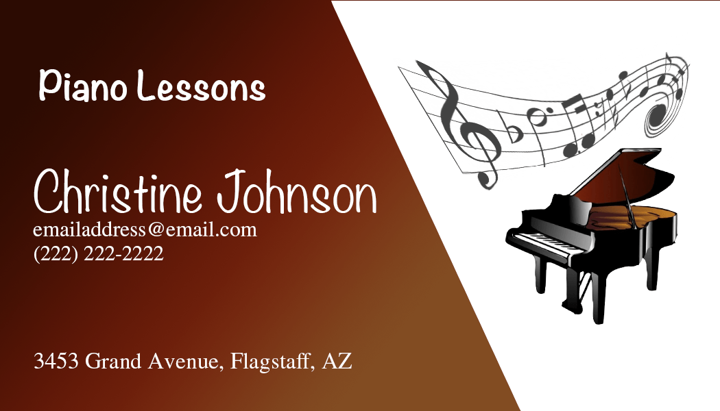
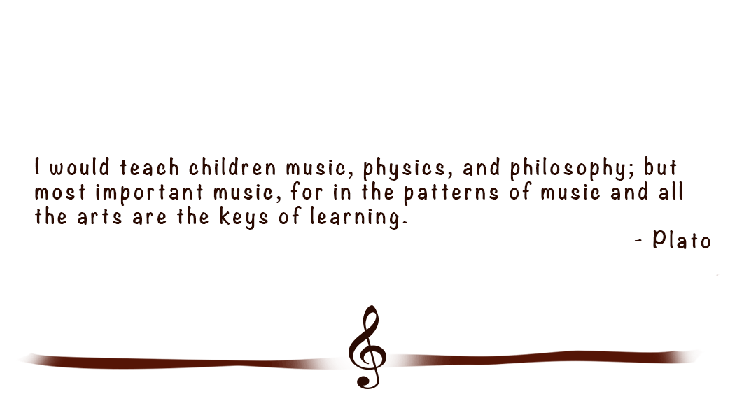
Background: My mom teaches piano lessons but doesn't have business or pass-a-long cards. Often with individuals who do music lessons the number of students you teach depends on the information that you get out about yourself and how many people know about you. A business card would make this easier as she meets new students but also to serve as a pass-a-long card that could be shared by some of her students to others as well. Initially the back of the card was going to be plain white to allow needed piano books to be noted as appropriate. To help the card feel more complete adjustments were made with the majority of the back still being white to allow for some notes if needed.
Contrast: A brownish-red color was used from the piano as a background for the text to contrast with the white of the text and the background with the other half of the image.
Alignment: I used left alignment for all the text. This helped to tie all the text together but it also connected the text with the image as the music staff had the straight edge on the left that also helped the image to feel left aligned as well.
Repetition: All the text is white in this image to make it stand out and to make it
Proximity: I kept the images close together and the contact information for the individual together.
Font: I used Noteworthy font for the two lines of text that I wanted to stand out (the name and the piano lessons) and adjusted the size to make it larger. I used STIXGeneral font for all the other fonts.
Color & Schemes: Color was used from the image inside of the piano to add a color accent to the card.
Photoshop
I opened a new Photoshop project and adjusted the size (1050 x 600 px @ 600 ppi). I opened the clipart images of the piano and music staff as separate layers. On the piano layer, I used the Select > Subject to select the piano and duplicated this selection to a new layer. I placed both of the clipart images on the right of the canvas. I then used separate layers to add and place the text for the business card and grouped these. I added a solid fill layer, using the dropper tool to select colors from the inside of the piano. A mask was then used to remove some of the color from over the image and to add the 'shape' to the design. I adjusted the text color so that all the text was white.
After receiving feedback on this project, I went back and reviewed the project. It was recommended that I add a gradient to the background for the front of the card, using the gradient that was part of the piano design. I added a new layer and copied the layer mask to the new layer. I was then able to create a new gradient using the dropper tool to match the colors to the gradient in the piano. I also adjusted the size and placement of the text for the card.
I then decided to create a back for the card to help it feel more complete. I still wanted the back to have plenty of white in the design so that it would allow for notes of books or lessons that needed to be included. I used the custom shape tool to insert the music cleft and then used a frame for the ribbon on the bottom. I used the eraser tool to get the shape that I was looking for adjusting the opacity to fade the ends slightly. I used a color overlay to match the color for these to the colors on the back. I then added a quote from Plato and matched it to the placement of text on the front.
Credits
Fonts: Noteworthy and STIXGeneral
Piano picture found by googling piano clip art.
Musical staff was found by googling music staff clip art.
Piano picture found by googling piano clip art.
Musical staff was found by googling music staff clip art.
