Exhibit 6 - Book Cover
Design
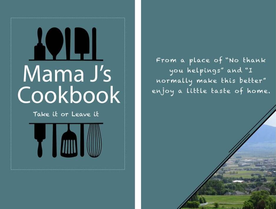
Background: At this point many of the recipes that my family uses are in different locations. Some have been written down on a cards, some are taken from cookbooks, some are recipes that have been passed down and memorized, and more. This has led to confusion when trying to find the recipe that you need. My family has talked about putting together a cookbook with the recipes that we use for some time and it is a work in progress. But there has been no design for the cover of the cookbook. For this design I wanted to create a simple design that individuals could relate to their memories. I also wanted this cover to be something that could last in the kitchen and be resistant to stains so I chose to use a darker color.
Contrast: I used contrast by using white text against the darker background. Black was also used as an accent in the design to help draw the viewers attention.
Alignment: The alignment for this project was all center aligned.
Repetition: In this project there is repetition in text fonts and color on the cover and the background. I also used decorative designs on the border of the image for the back cover to relate it to the utensil outline on the front.
Proximity: The text is kept together to show that the title and the subtitle were related.
Color Schemes: For the color scheme I used greens and blues in the background and the images.
Font Choice: Myriad Pro and Chalkduster
Photoshop
I began by opening a new art-board project in Photoshop. I began by choosing a background color and creating a new fill layer. I then searched for an image of kitchen utensils on google. When I found an image I opened it in photoshop as a new layer. Then using the Magic Wand Selection tool I was able to select the outline of the image and copied the selection to a new layer. I did this twice which allowed me to adjust the placement of the images.
I then used the text tool to add the title of the book. The design felt a little empty on the page so I used the rectangle tool to create an outline shape. I then used the move and transforms tools to make final adjustments to the design.
From here I was able to create another art-board for the back cover. I used the same color to create a color fill layer. Using the text tool I added a quote to the back. The book felt a little empty so I used the custom shape tool to insert a triangle in the bottom corner on a new layer. I found a picture of Hyde Park on google and opened it as a new layer in the project. I used a layer mask to limit the image to the triangle shape. I then used the brush tool to create a three line design on the edge of the triangle.
After receiving feedback on this project, I went back and reviewed the project. It was recommended that I adjusted the placement of the text on both covers to make it easier to read, adjust the the placement to better match the margins on both the front and back, and increase the vibrance for the image on the back cover. I used the text tool to separate "Mama J's" and "Cookbook" on separate layers so that I was able to move them as needed. Using the move tool I was able to shift the text around. I then used the text tool settings to adjust the spacing between letters and lines for the text on the back. Using the move tool I moved both the text on the front and back to match margins. I then moved to the back cover and used a Hue/Saturation level to increase the saturation of the image on the back. To do this without affecting the rest of the cover I copied the layer mask for the image to the Hue/Saturation layer.
Credits
Font Styles: Myriad Pro and Chalkduster
Inspiration for the cookbook title was influenced by a quote from Buddy Hacket, "My Mother's menu consisted of two choices: take it or leave it."
The utensils outline was found by googling cooking clipart.
The image on the back-cover was found by googling pictures of Hyde Park
Inspiration for the design on the side of the photo came from a postcard I remembered seeing at work.
