Exhibit 11 - Use of Photoshop Styles
Design
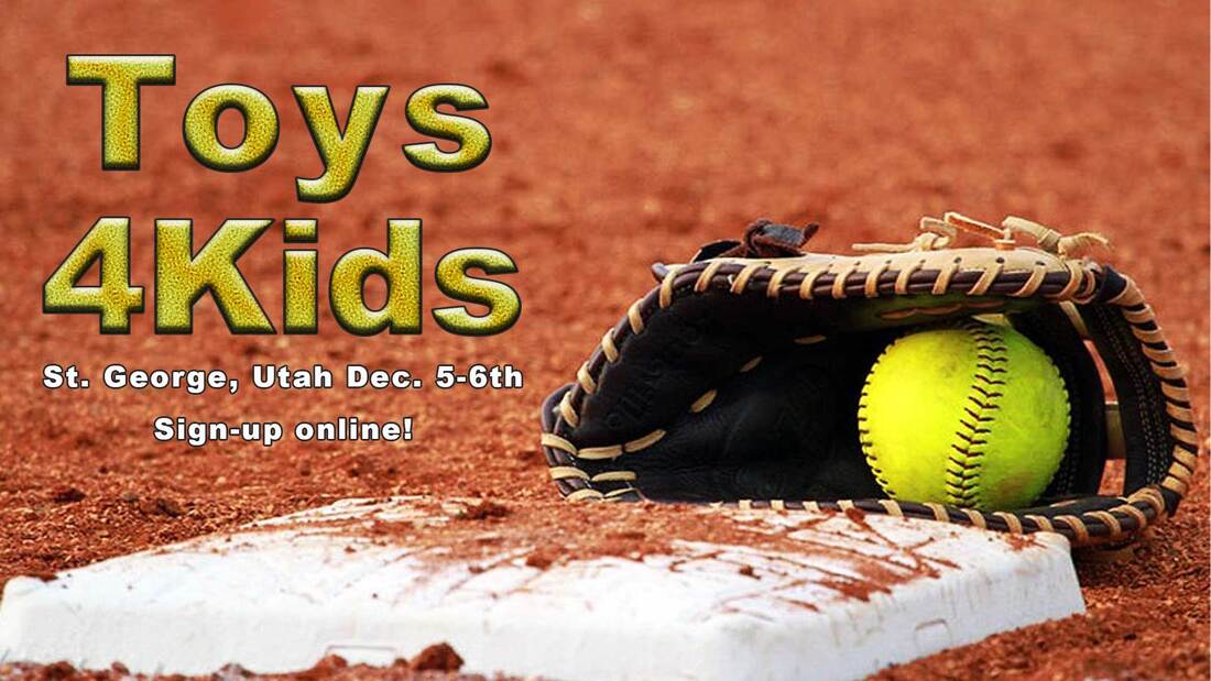
Background: The purpose of this project was to gain experience working in Photoshop, specifically in building and working with styles. Recently I was at a charity softball tournament so this project was to create a flyer for that. For this project I created my own style in photoshop and then applied that style in a project.
Contrast: The yellow in the ball and in the text stands out against the other colors used.
Alignment: Center
Repetition: The color of the ball is used as a color overlay in the style that has been applied. White is also used in the text to help to tie to the white base in the image.
Proximity: All the text was kept together within the design so that it was easy to follow.
Font: Arial Black
Color Scheme: Analogous - using reds/oranges and yellows.
Photoshop:
I began by opening a new file in Photoshop and using the text tool to create a layer that I could work with. I then used the effects layers to get the look of the softball layer. This included adding a Bevel & Emboss, Stroke, Inner Glow, Satin, Color Overlay, and Pattern Overlay. I worked through each of these effects adjusting the amounts until I got a look that I felt was realistic. Once this was done I saved the style and opened a new file.
In the new file I opened the softball image. Using the Move tool I moved and transformed the tool to the size of the background. I then used the text tool to add the content. I then applied the new style to the event title. I then added a Brightness/Contrast layer to the project to help some of the colors to stand out more. I considered adding both a Vibrance and color adjustment layer but felt that it was not needed.
In the new file I opened the softball image. Using the Move tool I moved and transformed the tool to the size of the background. I then used the text tool to add the content. I then applied the new style to the event title. I then added a Brightness/Contrast layer to the project to help some of the colors to stand out more. I considered adding both a Vibrance and color adjustment layer but felt that it was not needed.
Credits
Font: Arial Black
The background photo was found by googling softball images.
The background photo was found by googling softball images.
