Exhibit 5 - Newsletter
Design
|
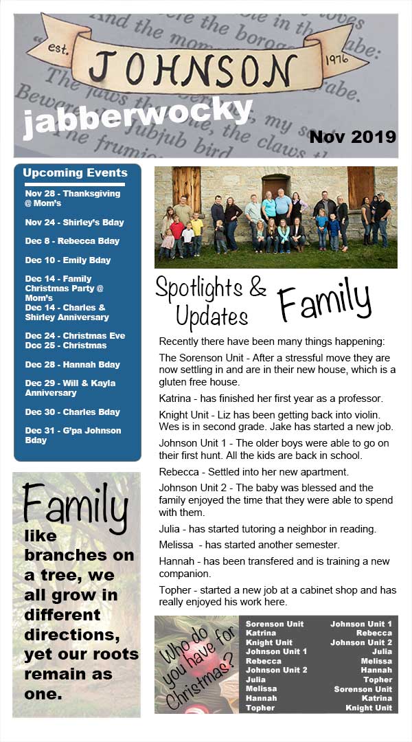
Background: My family has a family newsletter called the "Johnson Jabberwocky." Over the years the method of delivery has constantly been changed. Recently it has fallen back to be a word document that is sent out over email. Which works but it can be somewhat hard to skim through if you don't have as much time and it can be a lot. The goal for this is to organize the information in a way that is easier to follow visually.
Contrast: Different font types to emphasis words. Different boxes to make information stand out against each other. Blue was used as the color for the box for events to help make it stand out in the document. It is also the same color as the google calendar app. To help direct individuals to check the family google calendar. Alignment: The text is left aligned. Guides were created in the document to align content boxes with each other. Repetition: The same font styles are used throughout the project. Proximity: Information that is similar is kept in the same box. For example all the upcoming events are found in the same content box while all the updates are found in another. Font: Noteworthy and Arial Black Color & Schemes: The colors were very neutral with a highlight of the blue. There is a lot of gray, white, and black throughout the document. |
Photoshop
UsI opened a new photoshop project 600 px by 1080 px at 72 ppi. I then opened an image of the family crest that my sister had drawn. I used the quick selection tool to select the image and copied the selection to a new layer without the background. I used the crest for the background of the content and then adjusted the opacity so it was hard to see.
I then decided to use the family name and ribbon as part of the header. I used the rectangle tool to create a background layer for the header. I searched for images of the Jabberwocky poem by Lewis Carrol. I opened the image I was able to find and opened it in photoshop. I used the move tool to place and adjust the image over the rectangle and applied a mask so that the image only showed on the rectangle. I then adjusted the opacity of the layer to show the words over the gray rectangle. I adjusted the placement of the image of the family name and then added "Jabberwocky" using the text tool. I used the eraser tool to eraser small areas as needed.
After this I then moved to the content of the newsletter. Starting with the list of who everyone has for Christmas. I found an image of Christmas decorations. I opened this in photoshop and moved it to the bottom of the design. I used smart filters (sharpening and oil paint) to adjust the look of the image then I used the rectangle tool placing a rectangle over part of the image. This served as the background for some of the text. I then used the text tool to add the content for this space on the page.
I then moved to the calendar events that were coming up. Using the rectangle tool I added a blue rectangle, matching the color that is used for the Google Calendar app. I rounded the corners of the rectangle, then used the text tool to add the different upcoming events. I used the line tool to add a line to divide the events from the title.
I then added an image of the family and a rectangle with only the outline showing. I then used the text tool to add updates about what the family was doing. To finish off the design I found a quote about family and an image of a tree. I opened the image of the tree in Photoshop and added a new layer. Using the crop and move tool I was able to place the image. I then used the text tool to add the quote on top of the image. Using the layer grouping tool I was able to group the different layers into groups for the area that they were a part of.
After receiving feedback on this project, I went back and reviewed the project. It was recommended that I make efforts to increase the contrast in the image and to use the white space better. I removed the background with the family crest so that the background was just white. To better match the grays and blues in the design already, I adjusted the color of the calendar section to a darker blue. I then when through and adjusted the box and image sizes so that they were aligned and that they had space between the groupings. I also removed the rectangle surrounding the text for updates on the family. This allowed the white space to be used better.
Credits
Font styles: Arial Black and Noteworthy
The family crest image (used in the background and header) was used with permission from Julia Johnson.
Poem image used in the header was found by googling jabberwocky poem.
Christmas image was found by googling Christmas.
The image behind the quote about families was found by googling trees.
The family crest image (used in the background and header) was used with permission from Julia Johnson.
Poem image used in the header was found by googling jabberwocky poem.
Christmas image was found by googling Christmas.
The image behind the quote about families was found by googling trees.
